tl;dr: The gender pay gap in Ontario’s public sector is smaller than the province-wide average — but it hasn’t disappeared. In the core Ontario Public Service, women earn about 9% less than men on average. Women make up 55% of the OPS workforce but are still underrepresented in top-earning roles. The Sunshine List tells a similar story: women hold fewer spots at the highest salary tiers, and that gap has barely moved in years. Here’s what the actual data shows — and what it doesn’t.
The Public Sector Is Supposed to Be the Good Example
If you’re going to look for gender pay equity anywhere in the labour market, the public sector is usually where researchers point first. It has standardized pay bands. It has collective agreements. It has legislation – Ontario’s Pay Equity Act has been on the books since 1987. And unlike a lot of private employers, public sector pay is actually visible.
So how’s that working out?
The honest answer is: better than the private sector, but not as well as you might expect. The gender pay gap in Ontario’s public sector is real, it’s measurable, and it hasn’t moved as fast as the structural advantages would suggest.
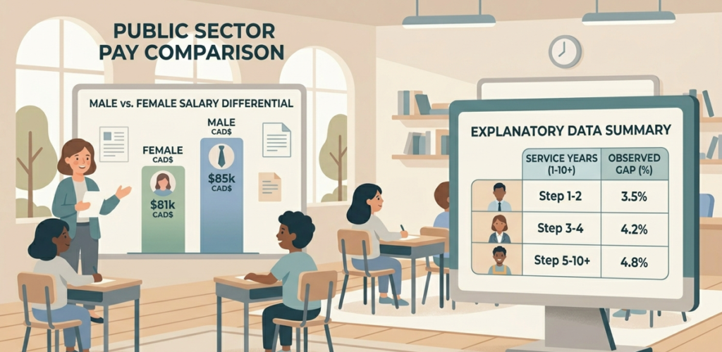
What the OPS Data Actually Says
The Ontario Public Service publishes its own workforce demographic data, updated through March 2025. Those numbers give us a pretty clear picture.
In 2025, the average salary for women in the OPS was $95,851. For men, it was $104,937. That’s a gap of roughly 9% — or about $9,000 per year.
Ten years earlier, that gap sat around 13%. So progress is real. But a 4-percentage-point improvement over a decade is slow by most measures, and the gap hasn’t closed equally across all levels.
Women represent about 55% of the total OPS workforce — meaning the public service is actually majority female. But when you look specifically at management, women hold only about 52–53% of those positions. That gap between overall representation and management representation tells part of the story. The other part is about which roles women fill and which roles they don’t.
Much of what remains of the pay gap inside the OPS is tied to job distribution — particularly in senior technical, specialized, and legacy management classifications — rather than a situation where two people doing the same job are paid differently. That’s an important distinction, but it doesn’t make the outcome any less real for the women experiencing it.
The Sunshine List Tells a Harder Story
The Ontario Sunshine List – which discloses all public sector salaries over $100,000 — adds a layer that the OPS workforce statistics can’t fully capture. The Sunshine List covers the broader public sector: hospitals, school boards, universities, municipalities, and Crown agencies, not just the core OPS.
And the picture there is more uneven.
A 2019 analysis by Diversio found that women represented just 36% of top earners on the Sunshine List — and that figure had only improved by 3 percentage points since 2008. At that pace, women would not reach parity on the list until around 2068.
More striking is where women appear within the list. Women were overrepresented at the bottom — making up about 52% of employees in the bottom earning quartile (those earning between $100,000 and $106,000). At the top of the list, that share dropped to just 34%. The further up the salary scale you go, the fewer women you find.
That’s not just a compensation story. It’s also a representation story. Senior executive roles, major hospital leadership positions, and energy sector jobs that dominate the very top of the list are still heavily male.
Why the Gap Persists – Even in a Unionized, Pay-Equity-Protected Sector
This is the part that tends to surprise people. If pay equity is the law, if collective agreements set the rates, and if women outnumber men in this workforce — why is there still a gap?
The Ontario Pay Equity Office points to an uncomfortable truth: about 70% of the gender wage gap in Ontario remains unexplained after accounting for factors like education, job tenure, part-time vs. full-time work, and occupation. That unexplained portion is thought to reflect a mix of implicit bias, occupational segregation, and the way traditionally female-dominated fields are valued.
Even within the public sector, there are sectors within the sector. Nursing, social work, and administrative roles — all majority female — tend to pay less than, say, engineering, corrections leadership, or finance, even where the skill levels are comparable. The Pay Equity Act was designed to address exactly that problem, but implementation across hundreds of public employers is uneven and enforcement is complaint-driven, not automatic.
There’s also the question of negotiation. Research from the University of Toronto found that pay transparency laws — like the ones that make the Sunshine List possible — have accounted for about 30–40% of the closure in the gender wage gap in sectors where they apply. Disclosure helps. But it doesn’t solve the problem entirely, especially when the structural barriers to senior roles remain.
Ontario vs. the Broader Picture
To be fair, Ontario’s public sector does better than most comparators.
Province-wide, the hourly gender wage gap in Ontario hit 12% in 2025, according to the Ontario Pay Equity Office — meaning women earn about 88 cents for every dollar men earn on an hourly basis. That’s been stuck near that level for years. The annual earnings gap is larger: 28% when you look at total annual income, because part-time work, caregiving gaps, and career interruptions compound the hourly figure over time.
The Financial Accountability Office has found that women in Ontario’s workforce are actually better educated on average than men — with 42% holding a university degree compared to 36% for men as of 2022. More education, but still lower average pay. That’s a difficult pattern to explain away.
Across Canada, Ontario ranks seventh among provinces for its hourly wage gap — ahead of Alberta (18%) and British Columbia (13%), but behind provinces like Quebec and Manitoba (both at 10%). That gives some context, but it’s not exactly a high bar.
What This Looks Like Going Forward
OPS data suggests the gap could narrow to around 7–8% by 2027 if current trends continue. That’s meaningful progress, but it’s also gradual — and it assumes no major policy shifts.
The OPS has committed to diversifying senior leadership, with targets tied to parity with the Ontario labour force by 2025 for its most underrepresented groups. Women in management have been part of that push. The results have been incremental, with management representation improving by roughly five percentage points over the last decade.
A few things would move the needle faster. Better representation in senior technical and executive roles matters more than any single policy. Closing the gap within female-dominated sectors — through updated job-to-job pay equity comparisons — matters too. And transparency, like what the Sunshine List provides, has a real track record of helping, even if it’s not a complete solution.
For a broader look at OPS workforce trends including age, tenure, and salary growth, the Ontario Workforce Demographics article covers that ground in more detail. And if you want to see how different sectors and ministries compare, OPS Ministry Salaries 2025 breaks down what the most recent Sunshine List tells us.
The Honest Takeaway
The gender pay gap in Ontario’s public sector is real but narrowing. The public sector genuinely does better than the private sector — the structural protections are real and they matter. But “better than average” isn’t the same as equitable.
Women make up the majority of the OPS workforce. They’re well-educated. Many of them are in management. And they still earn, on average, about 9% less than their male colleagues. At the top of the Sunshine List, their representation is even thinner.
The data doesn’t suggest bad faith. It suggests structural patterns that change slowly. And if you want to know what’s actually happening in Ontario’s public sector — rather than what people assume — that distinction is worth understanding.
You can explore more articles on public pay trends, workforce statistics, and sector-specific salary analysis at PublicPayPulse’s Public Sector Insights hub.
Image Alt Text Suggestions:
- Primary: “Flat illustration showing a bar chart comparing gender pay in Ontario’s public sector”
- Secondary: “Flat illustration of a document representing pay equity reporting with a magnifying glass”
Outbound Links Used:
- Ontario Pay Equity Office – https://payequity.gov.on.ca/the-gender-wage-gap-its-more-than-you-think/
- Financial Accountability Office – Women in Ontario’s Labour Market – https://fao-on.org/en/report/wilma/
- Ontario Pay Equity Act – https://www.ontario.ca/laws/statute/90p07
Internal Links Used:
- Ontario Sunshine List dashboard – https://publicpaypulse.com/ontario-sunshine-list
- Ontario Workforce Demographics 2026 – https://publicpaypulse.com/public-sector-insights/2025/10/15/ontario-public-workforce-demographics-2026-a-closer-look/
- OPS Ministry Salaries 2025 – https://publicpaypulse.com/public-sector-insights/2026/04/13/ops-ministry-salaries-2025-sunshine-list/
- Public Sector Insights hub – https://publicpaypulse.com/public-sector-insights/