tl;dr
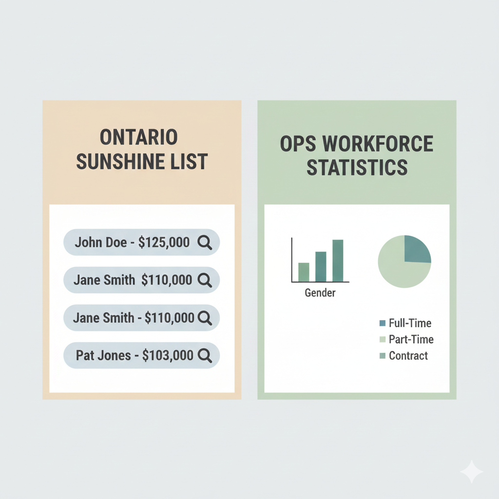
The Sunshine List shows individual public sector salaries over $100,000.
OPS statistics show workforce-wide data like headcounts, averages, and trends.
They answer different questions and are often misunderstood as the same thing.
If you’ve spent any time looking up public sector pay in Ontario, you’ve probably run into both the Sunshine List and OPS statistics. And honestly, it’s easy to assume they’re just two versions of the same data.
They’re not.
The difference matters, especially if you’re trying to understand public sector compensation, workforce size, or pay trends over time. So let’s slow this down and walk through what each one actually shows, what it leaves out, and when you should use one instead of the other.
What the Sunshine List actually shows
The Ontario Sunshine List is a salary disclosure list, not a workforce database.
It publishes the names and earnings of public sector employees who made $100,000 or more in a calendar year. That’s it. No averages. No context. Just individual disclosures above a fixed threshold.
A few important details that often get missed:
- The $100,000 threshold has not changed since 1996
- It includes base salary plus taxable benefits
- It only captures people above the cutoff
- It’s released once a year, usually in March
If you want a deeper breakdown of how it works, this article walks through it step by step:
How the Ontario Sunshine List Works
Because of the fixed threshold, the Sunshine List tends to grow every year, even when real wages barely move. Inflation quietly does most of the work.
That’s why headlines can feel misleading if you don’t know what you’re looking at.
What OPS statistics are designed to show
OPS statistics come from workforce reporting published by the Ontario Public Service and related government bodies. These datasets focus on the system as a whole, not individual names.
They usually include things like:
- Total number of employees
- Average and median salaries
- Occupational groups
- Gender and age distributions
- Full-time vs part-time breakdowns
- Long-term hiring and retirement trends
Instead of spotlighting who crossed a line, OPS statistics show how the public service is structured and changing over time.
If the Sunshine List answers “who earned over $100k,” OPS data answers questions like:
- How big is the workforce?
- Where are people concentrated?
- How pay varies across roles
- What’s happening year over year?
Those are very different jobs.
Sunshine List vs OPS statistics side by side
Here’s a simple way to think about it.
| Feature | Sunshine List | OPS Statistics |
|---|---|---|
| Individual names | Yes | No |
| Salary threshold | $100,000+ only | All salary ranges |
| Workforce size | Partial | Complete |
| Trend analysis | Limited | Strong |
| Public visibility | High | Moderate |
| Update frequency | Annual | Periodic |
This is why using Sunshine List data to make claims about “average public sector pay” usually leads to bad conclusions. You’re only seeing the top slice.
Why people confuse the two so often
Part of the confusion comes from how frequently the Sunshine List gets cited in media. It’s public, searchable, and easy to headline.
OPS statistics, on the other hand, tend to live in PDFs, tables, or reports that take a bit more work to interpret.
Another issue is that both datasets talk about public sector pay, but from opposite angles. One highlights outliers. The other focuses on structure.
When those get blended together, context disappears.
We see this a lot in discussions around growth in six-figure earners. This breakdown helps explain why that number keeps rising: Why the Sunshine List Threshold Is Still $100,000
When the Sunshine List is the right tool
The Sunshine List is useful when you want to:
- See who crossed the $100k threshold
- Compare roles or employers with high earners
- Track growth in six-figure salaries over time
- Look up a specific name, job title, or organization
It’s especially effective when paired with sector analysis, like this breakdown of high earners by industry:
Which Ontario Sectors Have the Most $100K+ Earners
Used carefully, it can reveal real patterns. Used alone, it can distort the picture.
When OPS statistics make more sense
OPS statistics are better when you want to understand:
- How large the public service actually is
- What most employees earn, not just the top earners
- Staffing pressures and shortages
- Demographic and retirement trends
- Long-term compensation changes
They’re essential for policy discussions, workforce planning, and budget analysis. They just don’t generate splashy headlines.
And that’s probably why they get less attention.
Why PublicPayPulse uses both
At PublicPayPulse, we intentionally use both datasets together.
The Sunshine List shows visibility and accountability. OPS statistics provide balance and scale. When you combine them, you get a clearer picture of what’s actually happening.
That’s also why our tools don’t stop at a basic name search. Alongside searchable Sunshine List data, we surface interactive charts and summaries to help place individual salaries in context.
If you want to explore more breakdowns like this, you can browse the full library here:
https://publicpaypulse.com/public-sector-insights/
Final takeaway
The Sunshine List and OPS statistics aren’t competing sources. They’re answering different questions.
If you remember just one thing, make it this:
The Sunshine List shows who stands out. OPS statistics show what’s normal.
Both matter. You just need to know which one you’re looking at.