Introduction
If you’ve ever tried to search the Ontario Sunshine List and felt underwhelmed, you’re not alone. Most Sunshine List tools only offer a basic search box and a long table of names. That’s fine if you already know exactly who you’re looking for—but it doesn’t help much if you want context or trends.
This guide shows you how to search the Ontario Sunshine List effectively, using a tool that goes beyond simple lookups. In addition to standard search results, it includes interactive visual charts that make salary data easier to understand at a glance.
We’ll walk through how to access the tool, what you can search by, how to move between years, and how to unlock deeper insights hidden behind each result.
Step 1: Access the Sunshine List Search Tool
To get started, head to the main navigation bar and click Search the List.
This opens the full Sunshine List search interface. Unlike many other tools, this isn’t just a static database. It’s designed to let you explore the data instead of simply scanning rows.
If you’re used to older Sunshine List pages, this is where you’ll notice the first difference. Everything is built to be interactive, not just searchable.
Step 2: Choose How You Want to Search
You can search the Ontario Sunshine List using three main options:
- Name – useful if you’re looking up a specific person
- Job title – helpful when exploring roles like managers, directors, or specialized professionals
- Employer name – ideal for reviewing entire organizations, agencies, or municipalities
You don’t need to be exact. Partial names and keywords still return results, which makes exploration easier when you’re not sure of spelling or official job titles.
This flexibility is especially useful when you’re researching trends, not individuals.
Step 3: Understand the Search Results
Once you run a search, the results list displays all matching entries for the selected year.
Each row shows the key details you’d expect:
- Employee name
- Employer
- Job title
- Base salary
- Taxable benefits
At first glance, this may look similar to other Sunshine List tools. The difference becomes clearer once you start interacting with the results.
Step 4: Switch Between Years Using Year Pills
At the bottom of the results table, you’ll see year pills that let you jump between different Sunshine List years.
Clicking a year pill instantly reloads the results for that same search—without forcing you to start over.
This makes it easy to:
- Track salary changes over time
- See when someone first appeared on the Sunshine List
- Compare how roles or employers evolved year by year
Most Sunshine List tools require separate searches for each year. This one keeps the context intact, which saves time and reduces guesswork.
Step 5: Click a Row to Unlock Deeper Insights
Here’s where this tool really stands out.
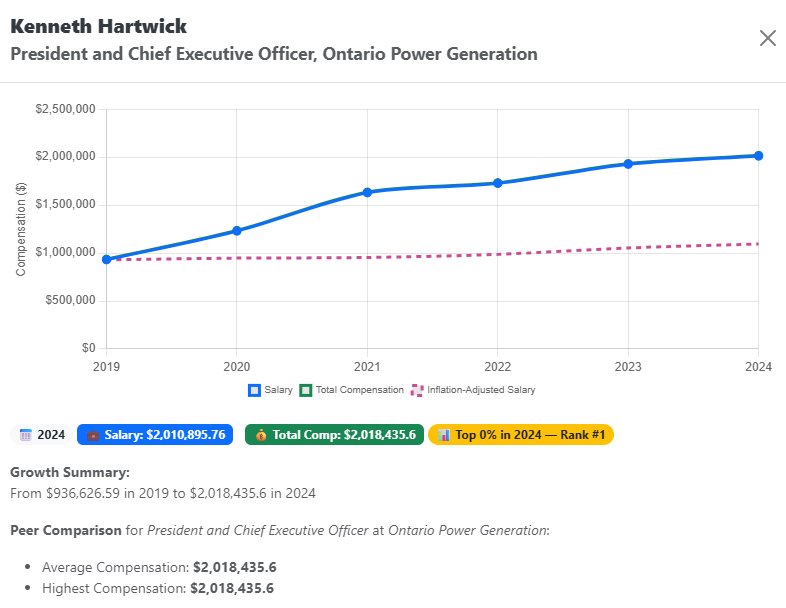
When you click on any row in the results table, an insight modal opens with a deeper breakdown of that entry. This is far beyond what standard Sunshine List databases provide.
Inside the insight view, you can see:
- Salary evolution over time, displayed as an interactive chart
- Total compensation, including taxable benefits
- Side‑by‑side comparison with inflation trends, adding real‑world context
Instead of guessing whether a salary increase is meaningful, you can actually see how it compares to inflation year by year.
Why Interactive Visual Charts Matter
Most Sunshine List tools stop at raw numbers. That forces you to interpret everything on your own.
Interactive visual charts change that experience. They help you:
- Spot long‑term growth or stagnation instantly
- Understand compensation beyond base salary
- See how pay changes align—or don’t—with inflation
For researchers, journalists, and curious residents alike, visuals reduce misinterpretation and make the data more transparent.
Tips for Getting More Value from Your Searches
A few practical habits can make your searches more useful:
- Try job title searches to understand pay ranges across roles
- Use employer searches to compare departments or agencies
- Switch years often to avoid drawing conclusions from a single snapshot
- Always open the insight modal before assuming a trend
Small steps like these turn a simple lookup into real analysis.
Final Thoughts
Learning how to search the Ontario Sunshine List effectively isn’t about finding a single number. It’s about understanding context, trends, and compensation over time.
While many Sunshine List tools offer only a basic search engine, this approach adds interactive visuals, historical continuity, and inflation comparisons that actually help explain what’s happening behind the data.
If you’re interested in deeper public‑sector pay insights, you can browse more articles on public pay trends at:
The more you explore the data thoughtfully, the more meaningful it becomes.